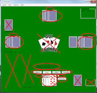
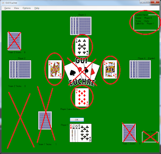
I need to (at some point) start thinking about how this thing is going to look. So I took some screenshots from the Windows game, and marked them up a bit with what needs to be done.
First, some things to get rid of, and move around:
Anything with a red X through it can be removed. The logo in the center is unnecessary. The visual representation of the score (Above “Team 1 Score” and Team 2 Score”) would take up too much space. Same with the visual representation of the tricks won be each team (this is empty, as this shot is from the beginning of the game, but they are normally above and below “Team 1 Tricks” and “Team 2 Tricks”.) The games won numbers will be moved to the statistics window. These are mostly things that I added because I had the room for it on a desktop environment, and add a bit of realism to the game. They are not, however, necessary to game play.
The circled information (team score and tricks) can be gathered into one place, which for now I have designated as the red rectangle in the top left. Or possibly score in the upper corner, tricks in the lower corner, or something like that.
Next, some things that are necessary to keep around, and in a similar place as where they are now
:
Again, I’ve X’d out the unnecessary things, but in this case the circled objects need to stay relatively close to where they are.
Players’ cards and name labels need to remain at the 4 edges of the “table”. There is also a (Dealer) label next to player 4’s name label, indicating that (s)he dealt this hand. There is also a (Pass) indicator that appears next to the names after a player passes their turn to call trump. (Since nobody has passed in this shot, the pass indicator is not present. But it is in a similar location to the dealer indicator.)
Near the bottom center (where the human player’s cards are) is a message to the user, indicating the most recent event in the game or what they need to do to further progress, below that are buttons (in this case for selecting trump, but other button appear there as well throughout the game. See the other screenshots to see those buttons) and below that are choices to call alone, or to pass (“Don’t Call”.)
These things all need to remain relatively close to their current position.
And lastly, some more things that need to stick around.
Once again, X’s through unnecessary items, circles are things that should stick around.
In the top right is information about the current hand: who dealt, who called trump, and what trump was called. This can be moved if necessary, but should still be present somewhere.
In the center are the cards that each player has played in this trick. If you look at the screenshot above, I use a similar location for the “Face up card” when calling trump (which ironically is face down in the shot.) In the mobile version these locations can be one and the same, but the face up card will still rotate around the table, to give a visual representation of who dealt the hand.
You can also see in this screenshot how the visual representation of the tricks are displayed. Team 1 has 1 trick, therefore 1 face down card is displayed above the “Team 1 Tricks” text – indicating that 1 trick, or book, has been taken by that team. As stated above, this is not necessary as long as there is a textual representation.


