Category Archives: Android

Auto Respond 1.2.9.3

I’ve pushed a new update to both the free and paid versions of Auto Respond. I’ve received a couple of crash reports, and have fixed those issues.

Sorry for the problems, but THANK YOU for the crash reports. Without those reports, I have no idea that there is a problem. Or if I am aware of a problem, I have no idea where it is generated. The crash report tells me the error code, and exactly what line of code generated the error. I can then look the code in question and see why that line may be generating an error.

Again, this is only a bug fix release, but it is important for you to update. The update has been published, but will probably not be pushed through Google’s servers for a couple hours.

Tic Tac Toe 1.2

I just published a new version of Tic Tac Toe:

  • Added ability to change the color of the X and O
  • Added ability to select which player plays first
These options are in a new settings screen, which can be found by pressing the menu button.
As usual, this update was just published and may not be available until Google’s servers refresh.
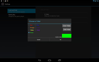
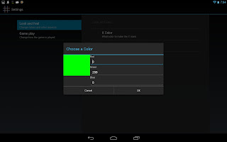
Here are some screenshots of the additions:

Tic Tac Toe – psychedelic!

As I mentioned the other day, I’m going to work on making some options for Tic Tac Toe. The past couple days I’ve been working on changing the color of the X and O.

Changing the color to predetermined values was easy. I had that done within a couple hours. Allowing the user to pick their own color… that was a little more difficult. I had to do some searching for a color selector, because for some reason there isn’t on available in the Android SDK.

The first one I found was WAY too small, hard to manipulate, and just not working well. If you touched and dragged, it wouldn’t actually drag. It was small even on a phone… when seeing it on a tablet, it was even more ridiculous how small it looked.

So I did some more searching and found an open sourced project with a much better implementation. It’s much larger, making it easier to see and manipulate, it scales well on a tablet, and dragging your finger after touching actually drags the marker. The only thing I could ask for that isn’t included is an RGB value of the color.

Here’s the code, in case you’re interested: http://color-picker-view.googlecode.com/svn/trunk/

Right now your options are: ROYGBIV (Red, Orange, Yellow, Green, Blue, Indigo, Violet) and using the color selector to create your own. I am thinking about adding an RGB value editor of my own… allowing the user to input a value for Red, Green and Blue, displaying the resulting color, and allowing them to accept or deny the color they have created. This should not be too terribly hard, I just haven’t done it yet.

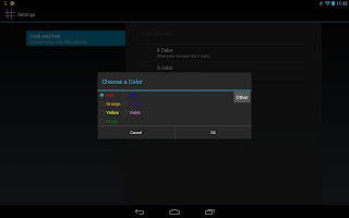
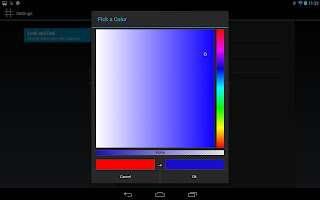
Here’s how it looks now: (screen shots from my Nexus 10)

The top screen is the selection screen, which includes my preset options and a button for creating your own, and the second screen is the color selector. (I’m just noticing now that one window says “Choose a Color” and the other says “Pick a Color”… I’ll change that.)

As you can see, the color selector is a nice size that is easy to manipulate. The scale on the right side is to choose a color range, and the big box that comprises the majority of the dialog is where you select the specific color. Just above “Cancel” and “OK” are the old color, and the new color.

As usual the final design may change slightly, but it’s far enough along that I figured I’d share.

Here’s a game in progress with some different colors selected:

Tic Tac Toe Ideas – user input wanted! Please leave some comments!

Sounds

I want to add some sounds to the end of the game in Tac Tac Toe. Like applause, or a fanfare, or something like that if you win, and maybe an “awww” type of sound if you lose, and I have no idea what to put if you tie.

I looked briefly for some free sound bytes, but I didn’t find much yet. Do you have a suggestion of sites where I can get some good sounds for free? (and by free, I mean legally free… not stealing sounds that are licensed by someone else.) Anyone willing to create some good sounds for me?

If I get enough good ones I can put a few different sounds for each scenario, so that it isn’t the same sound every time you win or lose. I can have it randomly choose a sound when it’s time to play the sound.

Images

Also, I’m thinking about giving the user the option to change colors of the X and O, and maybe creating some other themed items for players to use other than the traditional X and O. Any ideas for themes? I know there are existing games on the Play Store with puppies, and a couple other things, so I wouldn’t really want to copy any of those ideas. Again, I would need images that are free to use, or images created by myself or that you (my users) have created and would be willing to allow me to use for free.

I could also do themes based on holidays… those would mostly be easy to do. Hearts and such for v-day, pumpkins and creepy things for Halloween, Santa and trees for Christmas, Turkeys and pies for Thanksgiving, flags and fireworks for Independence Day… the list goes on.

Game Play

I know there’s not a lot to change about game play in Tic Tac Toe, but I could make an option for what player plays first – player 1, player 2, or random like it is now. Making it so that player 2 is always first would increase the difficulty a bit, and vice versa.

I’ve also seen games with larger game boards – is that something that would interest people? I’m not sure about the strategy for the larger boards, so it may be a while before I have a competent computer player, but I am always up for a programming challenge. Until then, I could make it just 2-player for the larger boards.

Other?

Any other ideas? I’m always open to suggestions. If you have anything, leave it in the comments or drop a line to my inbox.

Auto Respond 1.2.9.1

Sorry guys, someone sent in a crash report (thanks for that!)

In the free version, a crash is possible when entering one of the menus. This is because I didn’t merge one of the changes from the paid version.

It should be fixed in 1.2.9.1, but if you do experience a crash, the crash report system in Android is VERY useful when trying to fix them. If you could though, (and this goes for ALL apps, not just mine) please write in what Android version you are running when sending those reports. It’s not always 100% necessary, but it definitely helps when trying to figure out the problem.

Also, the menu in Android 2.x was also setup slightly different than it is in 4.x. I’ve updated the menu in 2.x to look the same as the 4.x menu.

The update has been published, and should be trickling through Google’s servers shortly. Look for it in the next hour or so.

Auto Respond 1.2.9

Auto Respond 1.2.9 has been published and is now live in the Play Store!

I tested it on Android 2.3 this morning using my roommate’s phone, and it’s a good thing I did because I found, and fixed, a bug that wasn’t occurring on my phone.

Here’s the full change log:

1.2.9:

(Pro)

  • Custom responses to individual contacts
(Common)
  • Fixed an issue with changing orientation on various screens
  • Fixed a rare issue with “Do Not Respond” list
  • Fixed a potential issue with auto starting the dock service after reboot
  • Fixed an issue where changing the message while Auto Respond was active would not update the message in the notification
  • empty space will be trimmed from the beginning/end of the response message before sending.
  • Made check boxes into on/off switches for users on Android 4.0+

New Auto Respond version coming soon!

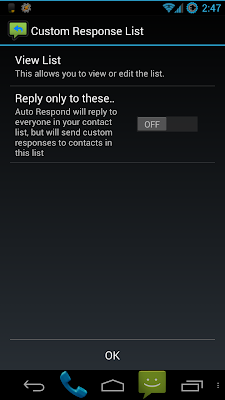
As I’ve been saying for weeks now, I’ve been hard at work on Auto Respond. Today I hit a milestone: custom responses are working!

Here’s how it works:

When you first go into the “Custom Response List” menu, you get 2 options: “View List”, and “Reply only to these contacts”

“Reply only…” is a toggle option, which makes it so that the app will only send replies if the call/text comes from a contact on this list. If you toggle this on with no people in the list, it will warn you that the app will not respond to anyone until you add someone to the list.

When you click on “View List” it takes you to a screen that looks just like the “Do Not Respond” list. When you click “Add” from that screen, it takes you to a new screen with the following:

  1. “Contact Picker” – just like when you press add in “do not respond” list
  2. “Use Custom Message?” – toggle
    1. “Custom Message” – text field
    2. “Message Position” – list
      1. “Custom message only”
      2. “Add custom message before default message”
      3. “Add custom message after default message”
(For the record, I think “default message” may sound confusing to users… if you have a recommendation for better terminology, I’d be glad to hear it!)

Some caveats:
  1. This new feature has not been tested on all Android versions yet. Only on my Galaxy Nexus running Android 4.2.1. This means that it’s not quite ready to be released yet… not until I do some testing on Android 2.x devices.
  2. This list currenty cannot be sorted. I likely will not add this until later, as the “Do Not Respond” list cannot be sorted either. these two lists would sort in a very similar way, so when I do sorting for one, I will likely port it over to the other.
  3. This will be a pro only feature
    1. this is mainly because it was so much work. If people appreciate the work that I put into this feature, I feel that it’s fair to ask a minimal price to use it.

As usual, I am still perfecting this as well. It works, but that does not mean it is 100% everything I want it to be. It is REALLY close though.

Here is the entire change log for this version as of now:

(Pro)

  • Custom responses to individual contacts

(Common)

  • Fixed a potential issue with auto starting the dock service after reboot
  • Fixed an issue where changing the message while Auto Respond was active would not update the message in the notification
  • empty space will be trimmed from the beginning/end of the response message before sending.
  • Made check boxes into on/off switches for users on Android 4.0+

Airpush: no thanks!

Today I got an email from Airpush, advising me that I can use their ad network to monetize my apps. My response: NO WAY!

For those of you who don’t know what Airpush is, you may have seen it and not realized it. It’s an ad network which displays ads in your notification panel. It’s the most intrusive and annoying way EVER to display ads. I have actually stopped using a few apps because they had Airpush ads.

The biggest problem: most of the time you don’t even know what app is displaying the ad! You see this ad in your notifications and think “Oh man, what malware did I download unknowingly?”

As a piece of advice to anyone who has run into this situation: download “Lookout Ad Network Detector”. https://play.google.com/store/apps/details?id=com.lookout.addetector

It’s a free app on the Play store, and it will tell you what advertising technique is used by each app on your phone. It does not constantly scan for apps that use intrusive ad techniques, but you can run a manual scan at any time and figure out what apps are using something like Airpush. And once you find the offending app, you can uninstall the detector if you wish.

In case you haven’t realized from the rest of this rant, I will NEVER put ads like this in my apps. Any practices that have driven me away from apps in the past will surely drive users away from my apps as well, and I don’t want that. I want to make some money off of my free apps, but there are a lot of user friendly ways to do it. Airpush is not in that list.

Updates – coming slowly but surely

I know it has been a while since I have updated Auto Respond. This isn’t because I’m not working on it, or I have nothing left to add… it’s because some of the stuff I’ve added is more work than I realized.

First – I think I mentioned before that changing 4.0+ to on/off switches from check boxes was actually a LOT of work that I did not count on. Now that I’ve figured out how they work, it’s not as bad anymore. But there’s still some work, and a lot of testing, to be done.

Next – The changing icon. I mentioned that I have found a way to change the icon of the entire app. Well, turns out that’s not entirely true. It changes the icon of an individual activity (such as the main screen) and in order to change it for the whole app, I would need a bunch of activity-aliases. It can be done, but it’s not quite necessary right now. There are more important things to do. And as I stated before, there are still problems with it. It changes the icon in the app drawer, but this change is not immediate. So if the “old” icon is still there and you click on it, it will say “App not installed” and it will take a few seconds for it to switch to the “new” icon. Until I figure out how to make that change immediate, this feature will remain unchanged.

Also – I mentioned some work on ignoring calls… unfortunately that still is not working properly either. So unless I get that fixed soon, it’s not going to be added. Sorry if anyone was looking forward to this functionality. I’m trying :-/

And lastly – something many of you have been waiting for: responses for individual contacts! I’ve started working on it and, as I expected, I ran into some road blocks. I told you guys before that it was a mess to get the functionality of this whole thing worked out in my head. Well, it turns out that I SILL don’t have it all worked out. As I started coding I realized “hey, where is going to go?” or “wait, if I do that, then I need to put there as well.” So I’m rearranging the whole thing so that it fits together nicely, and is easy to understand and navigate.

I was originally going to make this work a lot like the “Do Not Respond” list. But as it turns out there is a lot more I want to do with this than the Do Not Respond list, and it’s going to require a few extra sub-menus. I’ve almost got all of the menus written and working. I’ve also written the code to check and react to this list when sending responses. I’m not sure if it works properly yet (I haven’t tested it) but the code is written.

The good news – it’s in progress. And I’ve actually made a significant amount of progress on it in a very small amount of time. The bad news – it’s not quite done yet. And when it is done, it still needs to be tested.

I would give you some screenshots but things may still change, and the shots that I would be able to offer aren’t very impressive anyway.

Analytics Data

I just want to pass on some information to you guys that I got from looking at my analytics from Auto Respond.

Most Used Features:
It seems as if most people are interacting with Auto Respond as I would expect. The most common thing people are doing is clicking the toggle button on the main page. That is expected. That is the basic use of the app, so it should be the most often used feature.
It’s also the first thing you see, and for that exact reason – it’s the main purpose of the app. It’s the only right-justified item on the screen, and the only colored item on the screen. This is so that it will catch your attention.

The next most used feature is the message list. People are going in there and creating new messages, editing messages, sorting messages, and even using the “Get Current Message” button, which is one of the things that I was worried that people might not use. It looks like I was wrong on that.

Little Used Features:
The one thing with the messages that nobody has used since I started collecting analytic data is deleting a message. Again, this is to be expected. The option exists, and I’m not going to take it away, but I would expect that most people will either never use that feature, or use it very little.

Another thing I see very little of is swiping to change tabs. This is most likely because the majority of users are using the free version, and have no need to use the scheduler tab. I only see 1 swipe so far… again, somewhat expected.

Some of the other things that are not getting used much: the menu items other than settings. The settings are being use a decent amount, but the other menu items are hardly touched. Again, I would expect this. However, a few people have clicked on “My Other Apps”, “Feedback”, and even “Donate” in the paid version. (Nobody has actually donated to me, but it has been clicked)

Completely Unused Features:
It seems that nobody has used the help screen or the credits screen, at least since I started keeping track.  Also, nobody seems to have clicked on the “Buy” button in the menu, or when you try to create a schedule in the free version. As with the other features that aren’t used often, I will not take these away. I think they are necessary, and someone will inevitably use them at some point. However, I would expect that these things are not going to be used often.

Future Data:
Having all of this said, there are a few things I would like to add to my analytics. Things that I’m not currently keeping track of that I think would be helpful.

  1. Docking
    1. How many times is the app activated by docking the phone?
    2. How many of those are car docks vs. desk docks?
  2. Schedules
    1. How many times is the app activated/deactivated by a schedule in the paid app?
  3. Duration
    1. How long do people generally keep the app active before disabling it again?
    2. This is more of a curiosity than anything else. Not sure how it can help me improve the app, but it would be cool to know.
    3. Also, I’m not sure how I would do that. I’d have to look into how exactly analytics reports data, and maybe create a new category or something.
  4. Settings
    1. I’m still not keeping track of exactly how people are using the settings, and I would like to do that. I’m not sure the best way to go about it though.
Questions for you – my users:
Is there any specific usage information that you would be interested in knowing? 
If it’s something that I’m not tracking yet, maybe I can look into adding it to my list. If it is something in my list above, let me know that you’d be interested in seeing that data once it’s available. If it’s something that I am tracking already, I’ll most likely let you know if you ask for it.
Is there something that you do a lot that I didn’t cover?
I’m sure that there are other things in the app that I’ve missed in my tracking. I don’t track every little thing that happens, but I do track the ones that I think are important. Let me know if I’ve missed something important!

Is there something you wish you could do that I can maybe add to future versions?
As always, I welcome feature requests. If there’s something that you have been desperately wanting from Auto Respond and I haven’t added it yet, let me know!
Let me know your thoughts! I want to make this app as useful as possible for people, and your input helps me do that!