Category Archives: Android

Widget FC

Just now, I got a FC from Auto Respond when trying to create a new widget. I hooked it up to my computer to try to figure out why it was FCing, and sure enough, it didn’t crash.

If you experience a FC when trying to create a widget, please send an error report if it gives you the option. This is the first time I’ve seen that happen, and if I can’t get it to reoccur I can’t get a log to help me fix it.

UPDATE: I’ve put out an update which may fix it. But if you see it crash, let me know.

Over 1,000 installs! And some other stats

Auto Respond

Today, Auto Respond surpassed 1,000 total installs between the free and pro version.

Sure, some of those may be people who used the free for a while, and then switched to the pro after using it. But still, it’s a good day.

Only 160 of those installs are currently STILL installed. That’s a 16% retention rate, which isn’t too bad considering the number of people using the Play Store and the number of apps available.

Tic-Tac-Toe

Tic-Tac-Toe, on the other hand, has 172 installs and 57 current users. This shows the difference in the quality people expect from their games vs. other apps. I think Auto Respond is a MUCH higher quality app than Tic-Tac-Toe, yet I have a much higher retention rate for Tic-Tac-Toe. At 33%, the retention rate is over double.

Ratings

On the other hand, people have not left any reviews on Tic-Tac-Toe. (The only review is actually from my mother. Thanks for that mom!) Auto Respond doesn’t have quite as many reviews as I would expect from the wide user base, but it definitely has a higher rate of ratings/install.

Ratings/total installs:

Auto Respond free: 1%
Auto Respond pro: 15%
Tic-Tac-Toe: .5%

Ratings/current users:

Auto Respond Free: 6%
Auto Respond Pro: 37.5%
Tic-Tac-Toe: 1.7%

Conclusion

What does all of this tell us? Basically, games are where it’s at for mobile development. Even simple games, like Tic-Tac-Toe. But people don’t want to spend the time to rate games, which is why so many games try to coax you into it by offering something in return for rating their app.

Auto Respond 1.3

Auto respond 1.3 has been released! For those of you running the free version, this is a minor change. But for those of you running the paid version, this took me months to complete. Here’s the changelog:

1.3:

(Pro)
• 1×1 widget for quickly toggling individual messages
• More widgets will be added in the future!

(common)
• List of contacts that have already been responded to is now done by contact id, not by name

I said I wanted to keep this for a couple of days to test the widget, but I’ve tested everything I can think of with it, and I can’t break it in any way. If you have the pro version, please check out the widget. If you break it somehow, let me know what went wrong and what you did to cause it.

If you don’t have the pro version, please think about purchasing it. The extra feature are really worth the minimal cost. And as I stated in the change log: now that I know how widgets work, I’ve got some ideas for more. But none of them will be coming to the free version.

As usual, I just posted this to the Play Store so it may be a couple hours before it’s available.

Auto Respond’s first widget is almost ready for release!

I’ve think I’ve gotten all of the oddities worked out of the first available Auto Respond widget, but I’d like to test it for a day or so before releasing it.

As I said in a previous post, right now it’s just a 1×1 widget. When you create the widget it asks which message you would like to attach to it. After it’s created, it displays the title of the message you selected, and the app icon. When that specific message is enabled, the icon will show the on colors (green with blue, or purple with pink) and when the message is inactive, the icon will be the red icon.

If you click on the icon, it toggles Auto Respond and inserts the selected message. If you click on the title of the message, you can select a different message for your widget.

If Auto Respond is activated within the app (and not from a widget) but there is a widget for the message that is used, the widget icon will turn to the on colors.

If Auto Respond is currently active and you click on a widget for a different message than the current message, that widget will change to the on colors and the Auto Respond message will be changed to the message for the selected widget.

If you delete the message to which the widget was attached, the widget will display an error message. If you click this error message, you can attach the widget to a new message.

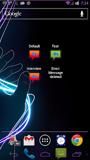
Here is a screenshot with a few widgets, including a broken widget:

In this shot, the “Test” message is enabled, and the others are obviously disabled. The “error” case was created on purpose for testing and demonstration purposes.

More Euchre interface ideas

Since I’m planning on having a database to store data, it will be easier to allow users to create multiple user profiles, and one device can then be used for multiple players. (Even using one login on devices that allow multiple device users.)

So I created a mock up of what I expect the user creation screen to look like:

I took a screenshot from my GNex used GIMP to make it plain white, then used MS Paint and GIMP to create this, so it’s not the best quality thing ever, but it gives you a general idea of what I’m thinking.

The only required piece of information would be the name. Each person needs a name, and they will be assigned an ID in the back end. I left some empty boxes, just because I don’t know what else people will want to put in there.

There are also options to import information from Facebook, Twitter and Google+. This is something that I’ve never actually done, so I’d have to look at their APIs and figure out how to do that. (Or if it’s even possible in the case of G+)

I also have achievements built into the Windows game, so I’d like to keep those and link them to a user profile as well. I also want an option for a user to backup this user data somewhere, and re-import it to a new device so that all of their hard work is not lost. Not sure if that’s possible without root access, but I’ll look into it.

For the picture, I’ll obviously come up with a default picture like most services do. That picture will be used unless the user uploads a new one, or pulls one from a social media site.

I’m generally a fan of the dark theme, but for this application I think the light theme will be a better fit. It will give a more upbeat feeling to the app, and I just think it will look better than the dark theme. As shown in this render, I will likely still use the dark theme for the buttons. This will make them stand out a bit from the rest of the UI.

Auto Respond widget progress

I had posted a question on StackOverflow about why my widget wasn’t working when clicked, and the other day someone responded asking if I was still having trouble with it. I was, so I said yes.

After seeing the response, I decided to show a friend of mine that it wasn’t working… suddenly, it WAS working, just not properly. Before, it had done nothing when I clicked the widget. Now, it did something, just not the correct something.

Fast forward to today. I decided to spend some time trying to figure out what the heck was going on. After a couple hours of sitting and coding, I got it working!… well, mostly. There are some display oddities if there’s multiple widgets on the screen, and it takes a while for the widgets to initialize… but it does what is expected when you click it!

I’m done for now (I need to get myself some lunch and give my eyes a rest from this monitor) but I’m sure that with a little more time spent on it, I can get this widget working 100% as expected.

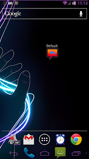
Right now it’s just a 1×1 widget. When you create the widget, it asks you which of your saved messages you would like to use. After it’s created, if you click the widget, it toggles Auto Respond and automatically changes the message to whatever you selected when setting up the widget. When you click the widget off, it toggles Auto Respond off, and returns the message to whatever it was set to prior to enabling it.

The left shot here is when it is off, the right is after toggling it on. I have the purple icon option turned on, so the on shot has the purple icon, but if the purple icon option was off, it would be the green icon. “Default” is the name of the message that I picked when I created the widget.

Once I get this one fully figured out and working 100% as I want it to, I am going to eventually add some larger widgets. Maybe some where you can insert a message on the fly, and toggle it as well. Maybe some for schedules, where you can enable/disable schedules from your home screen.

All widgets will only be available in the Pro version, so if you’re using the free version you will need to upgrade to use this feature once I release it.

For those of you currently running the Pro version, there MAY be a small bit of code that I accidentally left in the release version. You may be able to create a widget, but it will not do anything until I release an update.

Euchre – GUI Changes

I need to (at some point) start thinking about how this thing is going to look. So I took some screenshots from the Windows game, and marked them up a bit with what needs to be done.

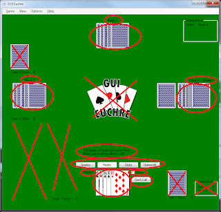
First, some things to get rid of, and move around:

Anything with a red X through it can be removed. The logo in the center is unnecessary. The visual representation of the score (Above “Team 1 Score” and Team 2 Score”) would take up too much space. Same with the visual representation of the tricks won be each team (this is empty, as this shot is from the beginning of the game, but they are normally above and below “Team 1 Tricks” and “Team 2 Tricks”.) The games won numbers will be moved to the statistics window. These are mostly things that I added because I had the room for it on a desktop environment, and add a bit of realism to the game. They are not, however, necessary to game play.

The circled information (team score and tricks) can be gathered into one place, which for now I have designated as the red rectangle in the top left. Or possibly score in the upper corner, tricks in the lower corner, or something like that.

Next, some things that are necessary to keep around, and in a similar place as where they are now
:

Again, I’ve X’d out the unnecessary things, but in this case the circled objects need to stay relatively close to where they are.

Players’ cards and name labels need to remain at the 4 edges of the “table”. There is also a (Dealer) label next to player 4’s name label, indicating that (s)he dealt this hand. There is also a (Pass) indicator that appears next to the names after a player passes their turn to call trump. (Since nobody has passed in this shot, the pass indicator is not present. But it is in a similar location to the dealer indicator.)

Near the bottom center (where the human player’s cards are) is a message to the user, indicating the most recent event in the game or what they need to do to further progress, below that are buttons (in this case for selecting trump, but other button appear there as well throughout the game. See the other screenshots to see those buttons) and below that are choices to call alone, or to pass (“Don’t Call”.)

These things all need to remain relatively close to their current position.

And lastly, some more things that need to stick around.

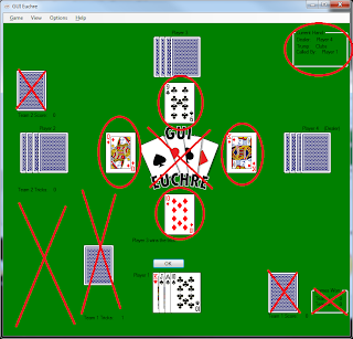
Once again, X’s through unnecessary items, circles are things that should stick around.

In the top right is information about the current hand: who dealt, who called trump, and what trump was called. This can be moved if necessary, but should still be present somewhere.

In the center are the cards that each player has played in this trick. If you look at the screenshot above, I use a similar location for the “Face up card” when calling trump (which ironically is face down in the shot.) In the mobile version these locations can be one and the same, but the face up card will still rotate around the table, to give a visual representation of who dealt the hand.

You can also see in this screenshot how the visual representation of the tricks are displayed. Team 1 has 1 trick, therefore 1 face down card is displayed above the “Team 1 Tricks” text – indicating that 1 trick, or book, has been taken by that team. As stated above, this is not necessary as long as there is a textual representation.

Euchre – Moving code is time consuming!

As I mentioned in one of my previous posts, I’m doing a lot of rearranging of existing code: Moving some stuff into existing object classes and creating some new classes.

Unfortunately, this does not necessarily mean less code, it actually usually means more code… and it means a lot of revamping on existing code to change it to object.function() notation. But the good part is that it means better organization of the code, and more secure code.

Previously, I had a lot of global variables so that I could access information from anywhere. Now, those global variables are mostly inside of an object (or will be soon.) This makes the information harder to access from the outside, making it more secure, and it also gives the code a better logical flow, which means that it makes more sense to me and anyone else who tries to interpret the code.

Even when originally creating this program I knew that having so many global variables was a bad idea, but at the time I couldn’t think of a better way to do it. I was still VERY new to programming (and still am fairly new at it) so I didn’t have a lot of the knowledge that I have now. (Plus it wasn’t a very public program, so I wasn’t too worried about doing things by the book. I just wanted something that worked.)

Another problem that I have is that most people will come up with an idea, then create a plan of attack (including things like: What objects do I need? How am I going to have the user interact with this? How do I want to display things? etc.) I normally do not. I sit down and start coding, and when I run into something where I ask myself “How am I going to do this?” I make a note, move onto something else, and think about a plan of attack later. (I’ve actually got more pre-planned with this project than I do on most of my projects)

I know, this is not a good way to do things, but it’s just how I am with everything. Planning is not my strong point, execution is my strong point. Even in high school and college, the teacher would say something like “You have all semester to do this paper. You should start it now or you’ll never get it finished!” I’d start a week before it was due. Sometimes less. Some of you might call that laziness, or procrastination (I would call it procrastination as well) but it’s also just a lack of planning on my part. But the best part is, I’d always do best on the papers/projects that I procrastinated most on. I guess I just work better under pressure.

But back on topic… as I’ve said a few times already, this code revamp is going to take a while. I have not even begun work on the UI layout, or anything that is user-facing code. It’s all been back end stuff, and it’s still a work in progress (even after spending about half of my day yesterday coding.) But the good thing is that when I’m done with this revamp, it’s going to be a much more solid product.

Side note: My main file still has over 11,300 lines of code. Admittedly, at least a few hundred to 1,000 of those lines are probably comments (one thing I DID do well with this was commenting) but that’s still a LOT of code. And that doesn’t even count the code in the object classes. However, I think a lot of code will be eliminated when I start getting rid of things like saving/loading files (I plan to use databases and SharedPreferences instead) and some of the Windows specific things (like only allowing 1 window to be open at a time, a lot of menu code – which I expect to be less code for Android, and a few other random things.)

Euchre Translation – preliminary thoughts

So I started looking through my code for my euchre game, and thinking of ways to improve my existing code. Mostly, ways to make this not seem like such a daunting task,

In my main file, which does most of the decisions on how the game is actually played, I have over 11,000 lines of code. Yes, you read that right. 11,000 lines in just one file. That’s insanity. So I got to thinking, I have many objects that I can distribute some of this code through.

Objects I have: CardDeck, EuchreDeck, PlayingCard, EuchreCard, Player, EuchrePlayer
Objects I think I should create: EuchreGame, EuchreHand, EuchreTrick, Stats
(All existing object classes have been translated to Android/Java already. The main code still has not.)

The CardDeck/EuchreDeck includes things like how many cards are in the deck, how to deal the cards, how to “shuffle” the cards

PlayingCard/EuchreCard contains things like the value and suit of the card, a “euchre value” of the euchre card, whether or not the card has been used, if it should display face up or face down, and the image associated with that specific card.

Player/EuchrePlayer has things like the name of the player, how many cards they currently have, what specific cards they have, whether they are human or computer, and their most recently played card.

EuchreGame will have things like the current score of the game, and achievement based variables.

EuchreHand will have things like a trick count for each team, whether or not someone called “alone”

EuchreTrick will have things like what player played which card

Then at the end of each trick, hand, and game, I can just create a new object which will reset the variables instead of resetting them in that already huge mess of code. It will make it look much better, and it will make it much more manageable in the future.

The game also keeps an insane amount of statistics, and displays them all in a single window (not sure how I’m going to display these stats on Android. Right now I have them broken into individual player stats, and team stats. I might have different tabs for each category, or I may have separate layouts depending on phone/tablet) All of these stats can be kept in an object instead of just variables, like they are now.

And there’s a lot of code that belongs in the existing classes which is not there yet. I just went through and marked a bunch of code that should be moved, and I’m sure there’s more. (I’ve only been through a couple hundred lines of the 11,000.)

Things I need to learn/plan/think about:

  1. How to write an object or variables to a file in Android
    1. The stats are kept in a file, and read from the file at the opening of the program. I don’t currently know how to do this in Android.
  2. How to network it
    1. I want to use Facebook and/or G+ to do something like “Words With Friends” or such games to allow people to play online. 
      1. Do I need a server of my own to do this? 
      2. Can I use the requesting device as a “server”?
      3. Can I use FB and/or G+ as a server?
    2. Should I make it live play only, or turn based like Words WF?
      1. I think making it turn based would be boring, but are people going to sit and play an entire game of euchre without quitting out? Having people constantly quit halfway through would be annoying.
        1. Maybe have it live, with an option to continue later?
    3. I have no idea how to do any networking in Android, so in any case I’m going to have a learning curve.
If you have any insight on the above (as a developer who can point me in the right direction for learning, or as a user who has a preference on game play) please leave a comment.
Euchre Card Design (and some game play design info)

I have finished the card design for my euchre game.

I went online and found a design someone else had made, then changed the design completely and only kept their template.

The design I found was close to a real deck of cards: the 9 of hearts has the number 9 and a heart symbol in the top left, and the same but inverted in the lower right, and 9 heart symbols in the center. This is how the cards in my desktop game are designed, and it works fine. However, a design like this would be hard to see on a phone, and maybe even a tablet. So I simplified it.

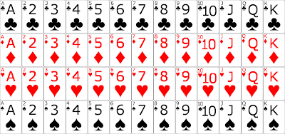
Each card now has the number (or letter) designating it’s value, and the suit symbol in both the upper left corner, and in the center of the card. In both places, the number is above the suit.

I kept the top-left notation because I want the cards in the game to be displayed as they would appear in your hand in real life: stacked over top of each other, with only the left side showing on all but the right-most card. Again, this is how the desktop game is setup.

However, when a card is played (or otherwise not in a player’s hand) the whole card will show. Also, I want to make it so that when you hover over a card in your hand, it will lift a bit, so you can see exactly which card you are choosing (again, like the desktop version) and to play the card, you will swipe up toward the center of the card table.

This is going to take a while to figure out how to do. As some of you know, I have a swipe action in Auto Respond, but the swipe is not animated. I have not yet figured out how to make the screen (or in this case an object) move as the swipe is occurring. This is something I will have to look into some more.

Here are the card images I will be using:

Depending on how well the images appear on screen, I may adjust the size of the text a bit. Possibly making the corner text slightly larger, and/or making the center text slightly smaller.

For those of you who know how to play euchre, you know that I only need the 9 through A of each suit for this game. But I figured that designing all of them would make it so that I can reuse them for other games if I want. (and I may use a 2 and 3 for showing the score, like I do in the desktop game. Although that would be tough to do without having multiple symbols in the center of the card. It may confuse some people.)

Also, I just realized I still need to design the back of the cards. As with the desktop game, I will likely have multiple designs for the back of the cards. A simple design of stripes or crisscrosses available in both red and blue, and maybe some special designs, like the 1515 Studios logo, or an Android (or bugdroid as some call it.) We’ll see what I come up with 🙂