Category Archives: Android

Do Not Respond Window (And happy holidays)

I realized the other day that there was yet another neglected window when I did my redesign… the “Do Not Respond” window.

Part of the reason why I forgot it is because it’s buried in the settings, and I cannot apply quite the same design to the settings window (or at least not easily… maybe I’ll look into that as a possibility.)

So I just spent a few minutes reworking that window as well. It was a quick and painless transition, but it isn’t really enough of a change to need a new release (especially since I just put out an update this morning) so I’m going to sit on it for a while, and it will be included in my next release.

Since I just mentioned it (and literally just thought of it as I was writing it) I will look into the possibility of adding a cancel and OK button to the bottom of the settings screens, to keep that constant with the rest of the app, but I’m not sure if that’s easily done. I may have to literally rewrite ALL of the code for those screens in order to make that possible, instead of just rewriting the layout and a small bit of logical code. If that’s the case, it will not be done. But if there is a way for me to easily add buttons to a settings screen, I’m sure I’ll find it.

Until next update, let me know if there are any feature requests or lingering bugs. Otherwise, you probably won’t hear from me for a week or so. I have family in town this weekend, and will likely be spending the next few days with them instead of my computer.

Happy holidays everyone! I hope you all get all of the presents that you asked for and, as always, stay safe!

Auto Respond 1.2.5

I just published an update to Auto Respond. Not much in the way of changes, but I may have potentially finally killed a big bug.

People have been emailing me, saying that sometimes my app doesn’t send a response. Some people have sent crash reports when it has happened, all of the crash reports pointed to a “null pointer exception”, but I couldn’t figure out where exactly it was happening. (Even with all of the information provided in the error reports.)

Today I was going through my code, block by block, and commenting it thoroughly, in case there comes a time when I put this away for a while and return to it months later. While I was doing this, I finally realized where this error is possibly being generated. (And possibly fixed some other errors in the process.)

That being said, here’s the change log:

  • More work towards supporting multiple languages
  • Some small bug fixes
    • Hopefully a fix for the people who have had occasional issues with it not sending a response (I’ve been looking to squish this bug for a while now!)
    • Small logic changes to fix things that you probably didn’t notice
I usually do this occasionally with all of my programs… go through them line by line, or block by block, and see what I have overlooked. Usually I do find something small that can be changed or improved somehow. This time I potentially found, and fixed, a big bug.
If you DO run into an issue where the app doesn’t seem to be sending responses correctly (or any other bugs for that matter,) please let me know via email, Google+, Twitter, whatever.
As usual, I JUST published this update, so it may be a couple hours before it’s live on the Play Store.

Google Analytics

Yesterday I started playing around with Google Analytics, and figuring out how to build it into Auto Respond.

The versions that are out now do not include Google Analytics in any manner, but I am looking into possibly building it into future versions. That would mean that the paid app would once again need internet permission in order to send the data back to Google, but this would be the ONLY information sent and there would be no personal information transmitted.

For those who aren’t aware, Google Analytics helps developers understand how users are interacting with their products. It will tell me how many times specific screens are viewed, how many active users I have, and potentially which buttons and other elements are interacted with most often.

This information can help me understand how you, as users, interact with my app. It can tell me which things you use often, which things you never really use, whether you tend to click buttons more than list views, and possibly even what settings are used most often.

I’m not sure of the exact information I can get, as I have just started playing with it, but rest assured that I will NOT be able to see that John Smith opened the app x times, or click this button, or has these settings set. I simply get a report for ALL of my users and cannot tell the difference between interactions from one user to the other. (I do not need, or care about, statistics on a per user basis in order to get useful information.)

I can then use this information to improve the parts of the app that are used most often. If people tend to use the scheduler a lot, I can spend some extra time with new features to give you more of what you want. Or if people use the preset messages a lot, maybe I can add more information to the list view, or create new sorting options, etc.

Or, on the other hand, if people tend to not click on my list views, I can make it more obvious to the user that clicking on the object will cause some action.

Overall I’m very excited to see what I can do with this tool! And once it’s set up I think it can greatly help me improve interactions in my app. The ONLY downfall is that the paid version will require permission to access the internet, which I think is a small price to pay for an improved app.

Let me know your thoughts, and if you have any experience with Google Analytics, feel free to let me know how it worked out for you!

TL;DR – Google Analytics will potentially help me understand how my users use my app, and help me improve the user experience.

Auto Respond 1.2.4.3

I just released a new Auto Respond, this is only for paid users. The only difference is a new sorting option for schedules.

Unfortunately, I was in the middle of working on this when I released 1.2.4.2, and included the incomplete code in that version, so I decided to finish this ASAP as to minimize problems. There will be even more sorting options in the future.

If you are using the paid version of 1.2.4.2 DO NOT sort your schedules until you update to 1.2.4.3. If you do sort them prior to updating you’ll likely end up with duplicate schedules, or missing schedules, and you’ll end up needing to delete them all and recreate them.

The new version was just published, and should be publicly available in an hour or 2.

Auto Respond 1.2.4

I just pushed an update to Auto Respond.

Here’s the changelog:

1.2.4.1:

(Paid)

  • Fixed an issue with the “Preset Messages” button in scheduler

1.2.4:

  • Changed how/when feedback window is displayed

(Free)

  • Interstitial ad should be less delayed when undocking
I realized after releasing 1.2.4 that the issue with the “Preset Messages” button in the paid version was still not fixed. So I looked at it again, fixed it for real, and released another update.
So if you are using the paid version, you should be looking for 1.2.4.1
if you’re using the free version, 1.2.4 is the latest.
These probably aren’t yet through Google’s servers yet, but they have been published and should be available shortly.

Auto Respond – Paid Features vs. Free Features

For those who are wondering how I’m distinguishing paid features from free features, I’ve come to the decision that anything that allows you to bypass seeing the ads will be a paid feature.

The whole point of a free version is to attempt to generate revenue from users clicking ads,  and to give the user a free “trial” of the app. But if you never see the ads, there is no chance of generating revenue. (I use “trial” for lack of a better word. But the free app is obviously fully functional, and without an expiration date. The paid app just has more features.)

This means that the following features will be paid only if/when they are completed:

  • Widgets
  • Timer
  • 4.2+ lock screen widgets
  • 4.2+ Quick Settings toggle (As stated before, not sure if this is even possible, but if it is, it will be paid only)
  • Any other new features that I come up with that bypass opening the app’s main screen
I will continue to improve the free version as well (as I have all along – I do have some improvement ideas that will apply to both) but the above features will not be available in the free app.
Although the ability to turn on Auto Respond via docking the phone DOES give the user the ability to bypass the ads, I’m going to leave it available for 2 reasons:

  • I don’t want to charge for a feature that once existed for free
    • other developers have done that in apps that I’ve used in the past and it soured me as a user, so I don’t want to do that to my users
  • It can be seen as a safety feature, so I want that to be available to all of my users.
    • Turning the app on when in a car dock can be seen as lessening distractions while driving, so I see it as a safety feature. I feel that everyone should have access to safety features for no extra charge.

To get the best of both worlds (allow users to use the dock feature, but also have them see an ad) I have added what is called an “interstitial” ad when you undock your phone. This will pop-up a full-page ad when you undock. It will only show up if Auto Respond is being turned off while undocking. This means that if you are not using the dock function, it will not randomly pop-up ads on you while removing your phone from a dock. (Of course, this ad only appears in the free app, not the paid app.)

This ad has been in the app for a couple versions now, so if you are using the dock feature, you should be seeing an ad when undocking.

I hope you agree with this decision, as it’s the best solution I could find that satisfies you as a user and me as a developer. If you have comments or questions, don’t be afraid to express them.

Auto Respond 1.2.3

I just pushed another update (lots of updates these last couple days!)

Change log is small, especially for free users:

  • Fixed an issue with the toggle button displaying incorrectly (sorry, old code that never got changed)

(Paid Only)

  • Added ability to start and stop schedules on demand
Here’s the new schedule screen:
This functionality came to me yesterday. My Monday meeting was moved, because my boss was out of the office for the day, so the meeting was Tuesday instead. It would have been nice to be able to click that button to start and stop the schedule at abnormal times. I started working on this last night, when I got home from work, and finished it up early this morning.
This layout was a pain to figure out a good way to display all of the information as well as the buttons, but I think this is good way to do it. Each individual row is a bit taller because of the buttons, but I feel that it was a necessary side effect. (Plus it gave me a new way to organize the text more effectively.) 
As usual, if you have input on how it can be improved feel free to talk to me. I’m always open to feedback.
This update was just recently published, so it may be a while before it’s live on Google’s servers.

Auto Respond 1.2.2

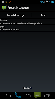
I finished the new look, including the “Preset Messages” window. Version 1.2.1 included the new look, but had some issues with deleting/editing messages so I pushed 1.2.2 to fix those issues.

Here’s that screen now:
1.2.2 should be live in the play store right now (I pushed it a while ago, and it appears to have gone through Google’s servers at this point.)
The Play Store listing for the free version may not immediately include the new screenshot of this screen, I apparently forgot to add that to the Play Store entry for the free version on my original push. But that screenshot will be up-to-date in a couple hours, and the app itself is up-to-date now. 
So even if you’ve already updated a few times today, go check the Play Store to see if there is another update (I’ve pushed at least 3 different versions today.) If you haven’t updated yet today, there’s definitely a new look waiting for you.

Auto Respond 1.2

I just released a new update to Auto Respond with a HUGE overhaul to the look and feel of the app, especially for people using Android 4.0+.

Here’s the change log:

  • Made some initial changes to help support multiple languages (days, months, and times should all support multiple languages now)
  • Lots of changes to look and feel of the app
    • Fully implemented Holo theme for Android 4.0+
    • Standardized windows throughout the app, as well as according to Android standards
    • Location of “OK” and “Cancel” buttons now follow Android guidelines (If you’re using Android 4.0+, that means they have switched sides, if you’re using Android 2.x, they’re the same as before)
  • Added more information to the email sent when clicking “needs improvement” on the feedback screen

Paid Only – (wasn’t an issue in free version)

  • Fixed some small issues with time display, if using 24-hour clock (some times were still showing in 12-hour style)
I hope you guys LOVE this new look! I know I do! (And I spent a ton of time perfecting it last night!) Here’s a preview – the main screen on Android 4.2:
The big differences here are that the “Preset Messages” button is now the width of the screen, and it is Holo themed. Plus, the former toggle checkbox is now also a Holo themed button, with a colored icon indicating its current state. When enabled this icon will be the green icon, or if you are using the purple icon it will be purple when enabled.
In android 2.x these will appear as gray buttons, but the icon is still present on the toggle button.
As usual, it will be a couple hours before this is live on Google’s servers. And if you find any issues, let me know

EDIT: I am noticing that the “Preset Messages” window is the only one that seems to not follow the standards set by the rest of the app, so I’m going to work on that. That particular window will be a little hard than others, because of the way I currently have it working, but I should be able to get it done tonight.

I plan on putting “New Message” and “Sort” buttons at the top, taking the sort option out of the overflow menu like in the scheduler window, and putting a “Cancel” button at the bottom. This will ensure that navigation between screens is consistent throughout the app.