Auto Respond 1.3.1

The new Auto Respond has been uploaded to the Google Play store. Again, nothing too big for free users, but a new widget for pro users.

Change log:

(Pro)

  1. Fixed error with scheduler displaying wrong day of week in extremely rare cases
  2. Fixed error with creating a widget with default message in rare cases
  3. Added 4×4 schedule widget (Android 4.0+)
  4. Toggling Auto Respond off will return response message to value prior to activating schedule or widget

(Common)

  1. Changed some appearances
As usual, it may not be live in the Play Store for a couple hours, but you can look forward to seeing it later today.
There are some quirks about the new widget:
  1. It’s only available in Android 4.0+
    1. Some of the things I used were added in API 11 (Android 3.0) and since this app is useless on tablets, and 3.x was only used on tablets, this widget is only available on phones with Android 4.0+
  2. When using the on/off toggle for an individual schedule, the widget must reload, which causes it to “blink”. It’s weird. I tried fixing it, but from what I’ve seen around the web there’s no better way to do it. 
I’m sure I’ll take another look into these issues in the future, and see if there is a better way to go about it, but for now it works with some small quirks.

EDIT: For the record, I currently only have 3 users on the pro that are on Android 2.x. Sorry to those 3 users. I tried making it available for everyone, but I couldn’t.

Schedule Widget almost done

So as I said before, I’ve been working on a schedule widget. I’ve gotten almost all of it working:

What’s working:

  1. App icon opens the app
  2. + icon adds new schedule
  3. Play icon starts schedule immediately
  4. Pause icon stops schedule immediately
  5. Pencil icon edits schedule
  6. On/Off button enables/disables schedule
What’s not working:
  1. Sort button does nothing. 
    1. I may drop this if I can’t get it to work. It’s not really necessary anyway.
  2. On/Off button does not change appearance when toggled
    1. It changes appearance if you remove/re-add the widget, but not immediately. Not sure why.
  3. List does not scroll
    1. I have not yet looked much into how to make it scroll. I found some documentation on it, but have not yet read through it.
    2. Preliminary reading indicates that it will only scroll on Android 4.0+
Good news – the list of “not working” things is quickly getting smaller. Yesterday none of the individual schedule buttons worked, and even as of an hour or so ago, only 1 worked properly. Now they’re almost all 100% functional.
As you can see in the screenshots, I changed the color of the top bar to be holo themed, so if you are using a theme that takes advantage of holo colors, the color of the bar will change with your themes. (Notice the color of the icons in the top right – like battery, wifi, and time – changed with my theme, and the widget bar matches that color.) 
This background is also semi-transparent, as it was way too bright when it wasn’t.
Now, onto some changes to the in-app schedule screen:
As I showed before, the menu is now on the bottom. I changed the edit icon to the pencil, as I said I would, and I added a delete button. Upon being pressed, the delete button displays a dialog asking “Are you sure?” in case you accidentally hit delete.
Nothing happens when you click/long-click anywhere other than those buttons. This is to make things more obvious to the user, and to make things easier on me as well.
I have tested this in both Android 4.x and 2.x,  and all buttons seem to work properly in both OS versions.

Auto Respond – some new looks

As I was working on the new widget, I was messing around with the way some things look. I tried finding a way to make each schedule use less space, while also looking cleaner, and I think I’ve found a good way to do it.

All the info about the schedule is now on the top, and all of the things you can do with it are in a menu below each schedule. There are no words in the menu, which saves space. Only descriptive icons, which are built-in icons from the Android system. (I might change the preferences – wrench – icon to an edit – pencil – icon)
Each schedule actually takes up slightly more vertical space, but I still think this looks better. Also, I somehow broke the click and long-click on the schedule info, but I’m working on getting that functionality back.
As you can see here, I’ve also added an icon to the new and sort buttons. This is probably not necessary, but I like the looks of it. These icons are also present in other screens which have the new and sort buttons.
I am most likely going to make the widget look more like this as well, but I will need to use something other than a switch for the on/off functionality. As I said yesterday, switches are not allowed in widgets for some reason.
So far, this is what I’ve come up with for the widget:
Again, there is slightly more space taken up. The other design showed 3 schedules in the space that this was shows roughly 2.5, but I think it looks cleaner.
Let me know what you think.

Auto Respond’s second widget

It’s not quite pretty yet, and not all of the features are quite there yet, but I’ve created a second widget. This one is for your schedules.

There are a few working parts already, but as you see there are a few things missing still.

Working:

  1. The Auto Respond icon in the upper left opens the app
  2. The + button allows you to create a new schedule
  3. All schedules display properly
  4. There is a semi-transparent black background on the widget, to show the boundaries of the widget
Not Working:
  1. The sort (a>z icon) button currently does nothing
  2. The start and stop buttons (play and pause icons) currently do nothing
  3. I cannot put a switch in a widget (limitations of the OS), so I may need a different way to toggle the individual schedules
  4. The list is currently not scrollable
The good news: 
  1. A lot of the hard work is done – The information displays, and I can get it to update properly.
  2. I know where I need to do work to make the start and stop buttons work. 
  3. I’m pretty sure I know what needs to be done for the sorting, I’m just too lazy to do it tonight.
  4. I’ve actually made some progress even while writing this blog entry (I’ve uploaded 3 different screenshots already)

Widget FC

Just now, I got a FC from Auto Respond when trying to create a new widget. I hooked it up to my computer to try to figure out why it was FCing, and sure enough, it didn’t crash.

If you experience a FC when trying to create a widget, please send an error report if it gives you the option. This is the first time I’ve seen that happen, and if I can’t get it to reoccur I can’t get a log to help me fix it.

UPDATE: I’ve put out an update which may fix it. But if you see it crash, let me know.

Over 1,000 installs! And some other stats

Auto Respond

Today, Auto Respond surpassed 1,000 total installs between the free and pro version.

Sure, some of those may be people who used the free for a while, and then switched to the pro after using it. But still, it’s a good day.

Only 160 of those installs are currently STILL installed. That’s a 16% retention rate, which isn’t too bad considering the number of people using the Play Store and the number of apps available.

Tic-Tac-Toe

Tic-Tac-Toe, on the other hand, has 172 installs and 57 current users. This shows the difference in the quality people expect from their games vs. other apps. I think Auto Respond is a MUCH higher quality app than Tic-Tac-Toe, yet I have a much higher retention rate for Tic-Tac-Toe. At 33%, the retention rate is over double.

Ratings

On the other hand, people have not left any reviews on Tic-Tac-Toe. (The only review is actually from my mother. Thanks for that mom!) Auto Respond doesn’t have quite as many reviews as I would expect from the wide user base, but it definitely has a higher rate of ratings/install.

Ratings/total installs:

Auto Respond free: 1%
Auto Respond pro: 15%
Tic-Tac-Toe: .5%

Ratings/current users:

Auto Respond Free: 6%
Auto Respond Pro: 37.5%
Tic-Tac-Toe: 1.7%

Conclusion

What does all of this tell us? Basically, games are where it’s at for mobile development. Even simple games, like Tic-Tac-Toe. But people don’t want to spend the time to rate games, which is why so many games try to coax you into it by offering something in return for rating their app.

Auto Respond 1.3

Auto respond 1.3 has been released! For those of you running the free version, this is a minor change. But for those of you running the paid version, this took me months to complete. Here’s the changelog:

1.3:

(Pro)
• 1×1 widget for quickly toggling individual messages
• More widgets will be added in the future!

(common)
• List of contacts that have already been responded to is now done by contact id, not by name

I said I wanted to keep this for a couple of days to test the widget, but I’ve tested everything I can think of with it, and I can’t break it in any way. If you have the pro version, please check out the widget. If you break it somehow, let me know what went wrong and what you did to cause it.

If you don’t have the pro version, please think about purchasing it. The extra feature are really worth the minimal cost. And as I stated in the change log: now that I know how widgets work, I’ve got some ideas for more. But none of them will be coming to the free version.

As usual, I just posted this to the Play Store so it may be a couple hours before it’s available.

Auto Respond’s first widget is almost ready for release!

I’ve think I’ve gotten all of the oddities worked out of the first available Auto Respond widget, but I’d like to test it for a day or so before releasing it.

As I said in a previous post, right now it’s just a 1×1 widget. When you create the widget it asks which message you would like to attach to it. After it’s created, it displays the title of the message you selected, and the app icon. When that specific message is enabled, the icon will show the on colors (green with blue, or purple with pink) and when the message is inactive, the icon will be the red icon.

If you click on the icon, it toggles Auto Respond and inserts the selected message. If you click on the title of the message, you can select a different message for your widget.

If Auto Respond is activated within the app (and not from a widget) but there is a widget for the message that is used, the widget icon will turn to the on colors.

If Auto Respond is currently active and you click on a widget for a different message than the current message, that widget will change to the on colors and the Auto Respond message will be changed to the message for the selected widget.

If you delete the message to which the widget was attached, the widget will display an error message. If you click this error message, you can attach the widget to a new message.

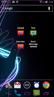
Here is a screenshot with a few widgets, including a broken widget:

In this shot, the “Test” message is enabled, and the others are obviously disabled. The “error” case was created on purpose for testing and demonstration purposes.

More Euchre interface ideas

Since I’m planning on having a database to store data, it will be easier to allow users to create multiple user profiles, and one device can then be used for multiple players. (Even using one login on devices that allow multiple device users.)

So I created a mock up of what I expect the user creation screen to look like:

I took a screenshot from my GNex used GIMP to make it plain white, then used MS Paint and GIMP to create this, so it’s not the best quality thing ever, but it gives you a general idea of what I’m thinking.

The only required piece of information would be the name. Each person needs a name, and they will be assigned an ID in the back end. I left some empty boxes, just because I don’t know what else people will want to put in there.

There are also options to import information from Facebook, Twitter and Google+. This is something that I’ve never actually done, so I’d have to look at their APIs and figure out how to do that. (Or if it’s even possible in the case of G+)

I also have achievements built into the Windows game, so I’d like to keep those and link them to a user profile as well. I also want an option for a user to backup this user data somewhere, and re-import it to a new device so that all of their hard work is not lost. Not sure if that’s possible without root access, but I’ll look into it.

For the picture, I’ll obviously come up with a default picture like most services do. That picture will be used unless the user uploads a new one, or pulls one from a social media site.

I’m generally a fan of the dark theme, but for this application I think the light theme will be a better fit. It will give a more upbeat feeling to the app, and I just think it will look better than the dark theme. As shown in this render, I will likely still use the dark theme for the buttons. This will make them stand out a bit from the rest of the UI.

Auto Respond widget progress

I had posted a question on StackOverflow about why my widget wasn’t working when clicked, and the other day someone responded asking if I was still having trouble with it. I was, so I said yes.

After seeing the response, I decided to show a friend of mine that it wasn’t working… suddenly, it WAS working, just not properly. Before, it had done nothing when I clicked the widget. Now, it did something, just not the correct something.

Fast forward to today. I decided to spend some time trying to figure out what the heck was going on. After a couple hours of sitting and coding, I got it working!… well, mostly. There are some display oddities if there’s multiple widgets on the screen, and it takes a while for the widgets to initialize… but it does what is expected when you click it!

I’m done for now (I need to get myself some lunch and give my eyes a rest from this monitor) but I’m sure that with a little more time spent on it, I can get this widget working 100% as expected.

Right now it’s just a 1×1 widget. When you create the widget, it asks you which of your saved messages you would like to use. After it’s created, if you click the widget, it toggles Auto Respond and automatically changes the message to whatever you selected when setting up the widget. When you click the widget off, it toggles Auto Respond off, and returns the message to whatever it was set to prior to enabling it.

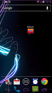
The left shot here is when it is off, the right is after toggling it on. I have the purple icon option turned on, so the on shot has the purple icon, but if the purple icon option was off, it would be the green icon. “Default” is the name of the message that I picked when I created the widget.

Once I get this one fully figured out and working 100% as I want it to, I am going to eventually add some larger widgets. Maybe some where you can insert a message on the fly, and toggle it as well. Maybe some for schedules, where you can enable/disable schedules from your home screen.

All widgets will only be available in the Pro version, so if you’re using the free version you will need to upgrade to use this feature once I release it.

For those of you currently running the Pro version, there MAY be a small bit of code that I accidentally left in the release version. You may be able to create a widget, but it will not do anything until I release an update.