Google Games is coming!

For those of you who don’t know, Google I/O starts on Wednesday!

There has been a LOT of speculation as to what will be announced at I/O, but there have been some things that have been pretty much confirmed, and right now, Google Games is one of them.

Android Police (AP) did one of their famous teardowns of some new a new Google Play Services app, and found a TON of references to Google Games, and even some working pieces!
http://www.androidpolice.com/2013/05/11/google-play-games-leaks-out-in-all-its-glory-ahead-of-google-io-hello-cloud-game-saves-apk-teardown/

Reading this got my mind rolling with ideas for Tic Tac Toe and Euchre. New achievements all over the place, new ways to get people connected, new ways to get more people playing, and new ways to have more fun with the games that I’ve already created! (Or in Euchre’s case, mostly created)

Since none of this has been officially released (or even officially announced) I can’t really start working on these things yet. But you can be assured that I will be working on it soon! (Well, once things get settled down in my personal life. Check out my personal blog for details on that.)

Auto Respond 1.3.3.1

Sorry for the bugs… I created a new function that was similar to an existing function. I copy and pasted the code, but what I didn’t realize is that the trigger had to be opposite on the new function.

This created all sorts of havoc. I found a few other things when I got home that needed to be changed to allow the new function to work properly.

It should all be fixed now though. The new version has been published, and should be available in a couple hours when Google’s servers sync.

Auto Respond 1.3.3 Bug

Sorry guys, but there is a bug in 1.3.3 that causes schedules and some other things to not work properly! I stupidly got some logic reversed, and broke some things.

It is a quick and easy fix… I’ve already fixed the bug in the code.. but I do not have a compiler on my work computer, so I can’t release an update until I get home! I’ll be home in about 2 hours, and I’ll release the new build ASAP!

Auto Respond 1.3.3

I said it would be quick, and it was.

I successfully added a “status” widget to Auto Respond, both Free and Pro. A lot of copy and pasting mainly, a few extra lines of code here and there, and bam: new widget. I hope you enjoy it!

As usual, the new version has been published, but may not be available for download for a couple of hours, due to delay on Google’s servers.

More Suggestions

As I said recently… I love my users!

Someone just contacted me about something which, unfortunately, cannot be done the way that it was presented. The user wanted me to make it so that when Auto Respond is on, the icon on a home screen shortcut would be green, and when it’s off the icon would be red. This icon cannot be changed dynamically like that (and if it can, I haven’t figured out how to do it yet) because the icon is actually hard coded into the app.

The good news is, there is another way to go about getting this functionality – and that is to make another widget! This widget would be available to both free and paid users, as it would not have any functionality that bypasses ads. I am going to call it the “Auto Respond Status” widget.

Basically, it will look like the message widgets: an app icon and some text. In this case though, the text will always be “Auto Respond”, and the icon is linked to the global status of Auto Respond, not the status of an individual message.

Clicking on this widget will simply open the app, just like a shortcut (dragging the icon from your app drawer to the home screen) would. But unlike that shortcut, the widget will show you whether or not the app is enabled by displaying a color coded icon.

I have not begun work on this widget yet, as I just received this request a few minutes ago. But I don’t think this will take me a lot of time. Much of the code from the message widget can be reused for this one.

Auto Respond 1.3.2.2

A new version of Auto Respond has been pushed to the Play Store.

Change Log:
  • Updated to new SDKs
  • Added option to promote Auto Respond with a text signature
The new SDKs include Google Analytics, which has better support for exception/crash reporting (thankfully, because now I can hopefully get more info from those reports,) and other small SDK improvements, most of which I don’t really care about.
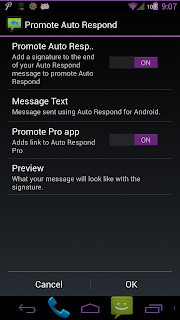
Here are some screenshots of the new feature. As I mentioned, I made it all optional. Even added a “Preview” option, so that you can see what you message looks like with the signature added.

Everything is purple in these shots because I still have my purple theme applied. It will be blue if you have the default theme applied to your device.

The main option defaults off, for both versions, and the “Promote Pro” defaults on for both versions.

Love My Users!

Love You Guys!

I’m not sure if I’ve said this publicly before, and if I have I surely don’t say it enough – I love the users of my apps!

Let me say that I originally developed Auto Respond as a tool that I, personally, had a need for. I decided that if I had a need for it, others surely will as well. That’s why I shared it freely for a while on forums, then eventually went onto the Play Store.

Even though I was my own customer originally, the people who use my app are constantly helping me improve it. If I had nobody out there pushing me to improve things, it probably wouldn’t get done. (Or at least, it would take a lot longer to accomplish.)

I am still the biggest critic of my own work. I always will be. I find a lot of bugs, crashes, typos, etc. before anyone else reports them. But I do love hearing from my users about possible additions, things that could possibly work better or differently, etc.

Suggestion

Having said all of that, a user came to me this morning with a painfully obvious suggestion. So obvious that I’m a little embarrassed to admit that I had never thought of it myself… promoting my app through a signature at the end of Auto Respond messages!

Now, I hope you all know by now that this is not something that I would force you into. That would alienate too many users. People don’t always like to be used as a free advertising tool. Other people, however, like to show off the tools that they are using, and help other people discover those tools.

That’s why I’m going to add this as an option to both the free and paid versions of Auto Respond. If you would like to tell others about Auto Respond, turn it on and spread the word. If you are in the group that finds that kind of thing intrusive, or don’t like the idea for some other reason, then don’t use it. It’s entirely up to you.

Some Questions

I’m thinking about also possibly making the message customizable, and obviously a link to the Play Store would be added to the end of that message. The one thing I need to think about is which version should I link to? Should I always link to a specific one (always free or always pro) or should I link to the app that the person is currently using? I’m thinking of linking them all to the paid version, simply because I feel that the extra features are worth the minimal cost. Or should I make that link an option as well? Free or paid option…

I’m also debating whether or not the option should default on. I was thinking default on for free users, then you can turn it off if you don’t want it on, and default off for paid users, and you can turn it on if you do want it. I’m afraid that defaulting it to on might still give people a negative feeling though.

What do you guys think? I’ve proposed a few questions here, and feedback would be appreciated! 🙂
Possible Auto Respond Crash Bug

I received a report in Google Analytics today that there was a crash in the settings menu in Auto Respond Free. The crash seems to have occurred on a Galaxy S3, running the latest version of the app (1.3.2), on Android 4.1.2, possibly from an international phone because the language was en-gb. (British English)

Yes, I can tell all of that from Google Analytics. What I cannot see is any identifying information about the actual user (name, location, anything like that – which I don’t really need anyway) and more importantly I cannot see the EXACT location of where the error occurred. Again, it appears to be in the settings menu, but it does not give me an exact line number.

I tried reproducing this error, and I cannot get it to crash on my Galaxy Nexus running 4.2.2. If you happen to run into this error (Or if you have an S3, or another phone running 4.1.2, and can recreate it for me) please send in a crash report when the FC happens so that I can get more details. I looked through my code, and cannot figure out where, or why, this error would have occurred. Since I cannot recreate the issue, I do not know if the bug exists in the pro version. The instance that occurred was reported by the free version.

For the record, it has been quite some time since there has been a crash bug reported in a market version of ANY of my apps, so this is a rare occurrence. For those of you who have been using my apps for a while, you know that I bugs very seriously (especially crash bugs) and I work toward fixing them as soon as I know of their existence. Sometimes, your help is necessary in finding the root cause.

Android Euchre Progress

I’ve finally done it… my euchre logic will compile… mostly.

The only part that doesn’t compile is displaying the cards, because I haven’t created all of the separate card images yet. I have the image with the entire deck, but I need to split that into 24 different files (Yes, 24. This is a euchre deck, not a regular card deck) then I need to resize those 24 files for different screen sizes.

Then after that’s all done, I obviously need to test to make sure I didn’t break any logic. Then I need to build in the options that I had in the Windows game, and the statistics that are in the Windows game, and build a menu, and work on the achievements, and getting it to network… so there’s still A LOT of work to do.

BUT, I have reorganized a lot of the logic into new object classes (which makes the logic easier to follow) and I’ve fixed some actual logical errors in the computer play logic (thanks to warnings in the IDE I’m using) and the layout is pretty much set (I might have to tweak it slightly for different screen sizes, but it’s mostly good)

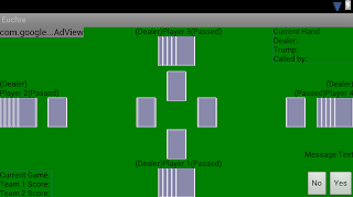
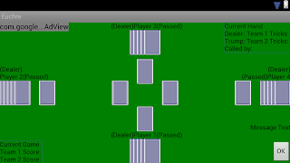
Here are some renderings from my IDE:

These renderings are emulating what the game would look like on a Galaxy Nexus.
I’ve included a few different views with different buttons that are used at different times. Also, different information is displayed at different times, so not all of the text boxes that you see will always be present at all times.
As you can see, there is an ad in the top left, (where it is very unlikely for the user to accidentally click it) hand information in the top right, game information in the bottom left, and most of the user interaction is in the bottom right.

The “Message Text” area is where all messages to the user will be displayed. This includes information about actions by the other players (IE: “Player 2 has passed” or “Player 2 has ordered the 9 of clubs to Player 3”, etc.) and it will have information as to actions that need to be taken by the player (IE: “Would you like to call trump?” or “Select a card to play”, etc.)

The cards in the center are the cards played by each player for that trick. This is also used as the “Up Card” display for player 1 and player 3. The “Up Card” for players 2 and 4 are closer to their hands.

There is a (Dealer) and (Passed) label for each player, which will be displayed as necessary. Once trump is called, all of the (Passed) labels will disappear, and some hand information will appear in the top right. The (Dealer) label will stay near the player who dealt until the next hand is dealt.

Redesigned Menus

After seeing how some other apps did menus, I realized that my menus were kind of out of date.

Mainly, a lot of apps use the “action bar” in Android 4.0 for their menu, then put the rest of the menu in the overflow menu. So I did this with all of my apps.

The settings button and the share button are now in the action bar, and the rest of the items are in the overflow menu. For users on Android 2.x, it’s all still in the menu, but many menu items now have icons associated with them.

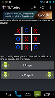
Also, in Tic Tac Toe the settings menu item is no longer present while in an active game. Previously, this item was present but would display an error dialog if clicked. Now it’s gone.

Here are some screen shots:

Look at the top right of the screen shot, just below the time. That’s where the menu is. Notice how the wrench icon is present in the first shot, but not in the second.

Auto Respond’s menu setup is identical to the setup in the first screen shot.

As usual, these updates have been pushed, but may take a while to be live on the Play Store.