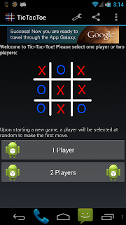
After seeing how some other apps did menus, I realized that my menus were kind of out of date.
Mainly, a lot of apps use the “action bar” in Android 4.0 for their menu, then put the rest of the menu in the overflow menu. So I did this with all of my apps.
The settings button and the share button are now in the action bar, and the rest of the items are in the overflow menu. For users on Android 2.x, it’s all still in the menu, but many menu items now have icons associated with them.
Also, in Tic Tac Toe the settings menu item is no longer present while in an active game. Previously, this item was present but would display an error dialog if clicked. Now it’s gone.
Here are some screen shots:
Look at the top right of the screen shot, just below the time. That’s where the menu is. Notice how the wrench icon is present in the first shot, but not in the second.
Auto Respond’s menu setup is identical to the setup in the first screen shot.
As usual, these updates have been pushed, but may take a while to be live on the Play Store.

