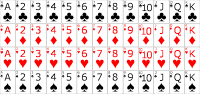
I have finished the card design for my euchre game.
I went online and found a design someone else had made, then changed the design completely and only kept their template.
The design I found was close to a real deck of cards: the 9 of hearts has the number 9 and a heart symbol in the top left, and the same but inverted in the lower right, and 9 heart symbols in the center. This is how the cards in my desktop game are designed, and it works fine. However, a design like this would be hard to see on a phone, and maybe even a tablet. So I simplified it.
Each card now has the number (or letter) designating it’s value, and the suit symbol in both the upper left corner, and in the center of the card. In both places, the number is above the suit.
I kept the top-left notation because I want the cards in the game to be displayed as they would appear in your hand in real life: stacked over top of each other, with only the left side showing on all but the right-most card. Again, this is how the desktop game is setup.
However, when a card is played (or otherwise not in a player’s hand) the whole card will show. Also, I want to make it so that when you hover over a card in your hand, it will lift a bit, so you can see exactly which card you are choosing (again, like the desktop version) and to play the card, you will swipe up toward the center of the card table.
This is going to take a while to figure out how to do. As some of you know, I have a swipe action in Auto Respond, but the swipe is not animated. I have not yet figured out how to make the screen (or in this case an object) move as the swipe is occurring. This is something I will have to look into some more.
Here are the card images I will be using:
Depending on how well the images appear on screen, I may adjust the size of the text a bit. Possibly making the corner text slightly larger, and/or making the center text slightly smaller.
For those of you who know how to play euchre, you know that I only need the 9 through A of each suit for this game. But I figured that designing all of them would make it so that I can reuse them for other games if I want. (and I may use a 2 and 3 for showing the score, like I do in the desktop game. Although that would be tough to do without having multiple symbols in the center of the card. It may confuse some people.)
Also, I just realized I still need to design the back of the cards. As with the desktop game, I will likely have multiple designs for the back of the cards. A simple design of stripes or crisscrosses available in both red and blue, and maybe some special designs, like the 1515 Studios logo, or an Android (or bugdroid as some call it.) We’ll see what I come up with 🙂
