All posts by Randy Havens

New Auto Respond version coming soon!

As I’ve been saying for weeks now, I’ve been hard at work on Auto Respond. Today I hit a milestone: custom responses are working!

Here’s how it works:

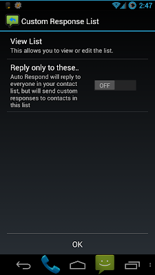
When you first go into the “Custom Response List” menu, you get 2 options: “View List”, and “Reply only to these contacts”

“Reply only…” is a toggle option, which makes it so that the app will only send replies if the call/text comes from a contact on this list. If you toggle this on with no people in the list, it will warn you that the app will not respond to anyone until you add someone to the list.

When you click on “View List” it takes you to a screen that looks just like the “Do Not Respond” list. When you click “Add” from that screen, it takes you to a new screen with the following:

  1. “Contact Picker” – just like when you press add in “do not respond” list
  2. “Use Custom Message?” – toggle
    1. “Custom Message” – text field
    2. “Message Position” – list
      1. “Custom message only”
      2. “Add custom message before default message”
      3. “Add custom message after default message”
(For the record, I think “default message” may sound confusing to users… if you have a recommendation for better terminology, I’d be glad to hear it!)

Some caveats:
  1. This new feature has not been tested on all Android versions yet. Only on my Galaxy Nexus running Android 4.2.1. This means that it’s not quite ready to be released yet… not until I do some testing on Android 2.x devices.
  2. This list currenty cannot be sorted. I likely will not add this until later, as the “Do Not Respond” list cannot be sorted either. these two lists would sort in a very similar way, so when I do sorting for one, I will likely port it over to the other.
  3. This will be a pro only feature
    1. this is mainly because it was so much work. If people appreciate the work that I put into this feature, I feel that it’s fair to ask a minimal price to use it.

As usual, I am still perfecting this as well. It works, but that does not mean it is 100% everything I want it to be. It is REALLY close though.

Here is the entire change log for this version as of now:

(Pro)

  • Custom responses to individual contacts

(Common)

  • Fixed a potential issue with auto starting the dock service after reboot
  • Fixed an issue where changing the message while Auto Respond was active would not update the message in the notification
  • empty space will be trimmed from the beginning/end of the response message before sending.
  • Made check boxes into on/off switches for users on Android 4.0+
Airpush: no thanks!

Today I got an email from Airpush, advising me that I can use their ad network to monetize my apps. My response: NO WAY!

For those of you who don’t know what Airpush is, you may have seen it and not realized it. It’s an ad network which displays ads in your notification panel. It’s the most intrusive and annoying way EVER to display ads. I have actually stopped using a few apps because they had Airpush ads.

The biggest problem: most of the time you don’t even know what app is displaying the ad! You see this ad in your notifications and think “Oh man, what malware did I download unknowingly?”

As a piece of advice to anyone who has run into this situation: download “Lookout Ad Network Detector”. https://play.google.com/store/apps/details?id=com.lookout.addetector

It’s a free app on the Play store, and it will tell you what advertising technique is used by each app on your phone. It does not constantly scan for apps that use intrusive ad techniques, but you can run a manual scan at any time and figure out what apps are using something like Airpush. And once you find the offending app, you can uninstall the detector if you wish.

In case you haven’t realized from the rest of this rant, I will NEVER put ads like this in my apps. Any practices that have driven me away from apps in the past will surely drive users away from my apps as well, and I don’t want that. I want to make some money off of my free apps, but there are a lot of user friendly ways to do it. Airpush is not in that list.

Updates – coming slowly but surely

I know it has been a while since I have updated Auto Respond. This isn’t because I’m not working on it, or I have nothing left to add… it’s because some of the stuff I’ve added is more work than I realized.

First – I think I mentioned before that changing 4.0+ to on/off switches from check boxes was actually a LOT of work that I did not count on. Now that I’ve figured out how they work, it’s not as bad anymore. But there’s still some work, and a lot of testing, to be done.

Next – The changing icon. I mentioned that I have found a way to change the icon of the entire app. Well, turns out that’s not entirely true. It changes the icon of an individual activity (such as the main screen) and in order to change it for the whole app, I would need a bunch of activity-aliases. It can be done, but it’s not quite necessary right now. There are more important things to do. And as I stated before, there are still problems with it. It changes the icon in the app drawer, but this change is not immediate. So if the “old” icon is still there and you click on it, it will say “App not installed” and it will take a few seconds for it to switch to the “new” icon. Until I figure out how to make that change immediate, this feature will remain unchanged.

Also – I mentioned some work on ignoring calls… unfortunately that still is not working properly either. So unless I get that fixed soon, it’s not going to be added. Sorry if anyone was looking forward to this functionality. I’m trying :-/

And lastly – something many of you have been waiting for: responses for individual contacts! I’ve started working on it and, as I expected, I ran into some road blocks. I told you guys before that it was a mess to get the functionality of this whole thing worked out in my head. Well, it turns out that I SILL don’t have it all worked out. As I started coding I realized “hey, where is going to go?” or “wait, if I do that, then I need to put there as well.” So I’m rearranging the whole thing so that it fits together nicely, and is easy to understand and navigate.

I was originally going to make this work a lot like the “Do Not Respond” list. But as it turns out there is a lot more I want to do with this than the Do Not Respond list, and it’s going to require a few extra sub-menus. I’ve almost got all of the menus written and working. I’ve also written the code to check and react to this list when sending responses. I’m not sure if it works properly yet (I haven’t tested it) but the code is written.

The good news – it’s in progress. And I’ve actually made a significant amount of progress on it in a very small amount of time. The bad news – it’s not quite done yet. And when it is done, it still needs to be tested.

I would give you some screenshots but things may still change, and the shots that I would be able to offer aren’t very impressive anyway.

Analytics Data

I just want to pass on some information to you guys that I got from looking at my analytics from Auto Respond.

Most Used Features:
It seems as if most people are interacting with Auto Respond as I would expect. The most common thing people are doing is clicking the toggle button on the main page. That is expected. That is the basic use of the app, so it should be the most often used feature.
It’s also the first thing you see, and for that exact reason – it’s the main purpose of the app. It’s the only right-justified item on the screen, and the only colored item on the screen. This is so that it will catch your attention.

The next most used feature is the message list. People are going in there and creating new messages, editing messages, sorting messages, and even using the “Get Current Message” button, which is one of the things that I was worried that people might not use. It looks like I was wrong on that.

Little Used Features:
The one thing with the messages that nobody has used since I started collecting analytic data is deleting a message. Again, this is to be expected. The option exists, and I’m not going to take it away, but I would expect that most people will either never use that feature, or use it very little.

Another thing I see very little of is swiping to change tabs. This is most likely because the majority of users are using the free version, and have no need to use the scheduler tab. I only see 1 swipe so far… again, somewhat expected.

Some of the other things that are not getting used much: the menu items other than settings. The settings are being use a decent amount, but the other menu items are hardly touched. Again, I would expect this. However, a few people have clicked on “My Other Apps”, “Feedback”, and even “Donate” in the paid version. (Nobody has actually donated to me, but it has been clicked)

Completely Unused Features:
It seems that nobody has used the help screen or the credits screen, at least since I started keeping track.  Also, nobody seems to have clicked on the “Buy” button in the menu, or when you try to create a schedule in the free version. As with the other features that aren’t used often, I will not take these away. I think they are necessary, and someone will inevitably use them at some point. However, I would expect that these things are not going to be used often.

Future Data:
Having all of this said, there are a few things I would like to add to my analytics. Things that I’m not currently keeping track of that I think would be helpful.

  1. Docking
    1. How many times is the app activated by docking the phone?
    2. How many of those are car docks vs. desk docks?
  2. Schedules
    1. How many times is the app activated/deactivated by a schedule in the paid app?
  3. Duration
    1. How long do people generally keep the app active before disabling it again?
    2. This is more of a curiosity than anything else. Not sure how it can help me improve the app, but it would be cool to know.
    3. Also, I’m not sure how I would do that. I’d have to look into how exactly analytics reports data, and maybe create a new category or something.
  4. Settings
    1. I’m still not keeping track of exactly how people are using the settings, and I would like to do that. I’m not sure the best way to go about it though.
Questions for you – my users:
Is there any specific usage information that you would be interested in knowing? 
If it’s something that I’m not tracking yet, maybe I can look into adding it to my list. If it is something in my list above, let me know that you’d be interested in seeing that data once it’s available. If it’s something that I am tracking already, I’ll most likely let you know if you ask for it.
Is there something that you do a lot that I didn’t cover?
I’m sure that there are other things in the app that I’ve missed in my tracking. I don’t track every little thing that happens, but I do track the ones that I think are important. Let me know if I’ve missed something important!

Is there something you wish you could do that I can maybe add to future versions?
As always, I welcome feature requests. If there’s something that you have been desperately wanting from Auto Respond and I haven’t added it yet, let me know!
Let me know your thoughts! I want to make this app as useful as possible for people, and your input helps me do that!

Some Updates

Today I’m going to give you some updates on things I’ve talked about in previous posts:

First, the Nexus 10 issue with USB Debugging: It turns out, the issue is in CyanogenMod. I installed AOKP, which is based on CM, and had the same issue. I went back to stock and it worked perfectly. So I guess I need to file a bug report with the guys at CM.

Next, the new look for 4.x: I said I was changing the check boxes to on/off switches. This is great… except in one area. (I also said in that post that I had not fully tested this yet.)

For some reason, the “SwitchPreference” doesn’t quite work as I would expect. I was working on something unrelated yesterday (I found a way to use an option to actually change the icon of the whole app, not just the icon of the notification) and realized while I was working on it, that these Switch Preferences did not quite work properly.

(WARNING: technical information included below. You may not understand all of this if you’re not familiar with programming.)
The problem is this: when I click on the on/off button it reacts differently than if I click on the text NEXT to the button.

If I use OnPreferenceClick, nothing happens at all when I click the button, but the function is called when I click the text.
If I use OnPreferenceChange, the function is called with the OLD value if I click on the button, and if I click on the text it’s actually called twice: once with the old value, and again with the new value.

This leaves me with an issue: how the heck do I deal with 1 item reacting in 2 completely different ways depending on how it’s interacted with? The answer: I still have no idea. If you have ANY insight as to how this works, I would LOVE to hear from you with ideas. In the meantime, I’m going to post on Stack Overflow and see if anyone there has any insight.

(END OF TECHNICAL INFO)

Well, that’s the news as of right now. Still no work on individual responses… I keep getting distracted by other things.

As always, let me know if you find any bugs or have any requests. And if you have any insight into the above problem, please let me know.

UPDATE: I figured out what I was doing wrong:

(Another WARNING: technical information below)
in OnPreferenecChange there are two parameters: Preference preference and Object o

Apparently preference holds the preference that is being changed, and o holds the boolean value of its state after the change. I was using preference.isChecked() as my reference, and had to change it to use o. (cast o as a Boolean, then use that value.)

(End of technical information)

I’m still working on figuring out all of the details of how to change the icon. I’ve figure out most of it, but there is a small side effect that some users may not like, so I’m trying to handle that before I finalize anything.

I’ll keep you up to date on progress 🙂

Another User Request

I’ve gotten another request from a user via a Play Store comment. Since I cannot respond to comments on the Play Store, I’m hoping that the user will see this post.

First and foremost… if you have a request for a feature PLEASE email me! That way I can reply directly. My email is listed on the Play Store and in the app in the “Credits” screen.

Now, onto the request. It was a 2-part request:

  1. Custom replies for individual contacts – as I’ve mentioned here before… I’m working on that. The hard part is not the coding, it’s working out in my head exactly how I want it to function. I think I’ve finally got it figured out, so I’ll probably start coding soon.
  2. “no reply option for non contact list numbers” – This is already done by default in the app. I thought it was in the app description on the Play Store, but apparently it’s not. However, it IS in the “About” screen in the app – “It will only respond to contacts in your address book”
    1. This is done because I don’t want to be sending text messages to non-cell phones. Therefore, when a response is being sent, the app first checks to see if the number is in your contact list. If it’s in your contacts, it checks to see if the contact is in your “do not respond” list. If it’s not in your do not respond list, it checks to see if the number is listed as a cell phone. If the number fails ANY of these checks, the response is not sent. (Oh, and after the cell phone check, it checks to see if the number has already been sent a response during the current session.)
    2. If anyone knows of a better way to check to see if a number is a cell phone, I’d love to hear about it. But I did some research early on, and right now this seems to be the only way to do it.
UPDATE: The information in #2 has been added to the Play Store description under “Features”, and #1 has been added in the description under “Ideas for future versions”.
There you have it. Some requests, some replies, and some insight into how the app actually works. I’ll be willing to bet that a lot of you had no idea there was so much going on before your response is sent. Fact is, there is a LOT going on in the background of this app that you don’t think about unless you’re the one who’s coding it. And the best part – all of this happens in a matter of milliseconds, so your response is usually received before the recipient has a chance to put their phone down. (assuming that you both have a good connection to the cell network.)
Side Note – I don’t know how many of you will actually use this, but I think I may have gotten the “Ignore Call” option working. I’ve yet to actually test it (I hope to do that today) but I actually understand how the code is working now. I added this option into my settings screen a while back, but it was disabled because it didn’t work. Then I removed it completely because I couldn’t fix it. Well, I may have finally fixed it 🙂

Then and Now – Auto Respond from inception to today

For those of you who haven’t seen every version of Auto Respond, you may have no idea how far it has come.

Tasker:
This app actually started as a set of Tasker profiles, which automatically sent a response to text messages while my phone was docked in my car. I’m not sure if you could do all of what it does now, even with 30 Tasker profiles.

From there, I used Tasker’s App Factory to turn my Tasker profiles into a simple app, with a simple interface. (I used literally the first ever publicly available version of App Factory to do this.)

It looked like this:

Pretty hideous compared to what it is now, and the icon was just something I pulled from Tasker. Because it was so hideous, I decided to learn how to make an ACTUAL Android app, and code it myself. The first coded version looked a lot better, but still needed a lot of improvement.

My Own Code:
I asked a friend of mine from high school, who is into digital design, to design an icon for me. I told him I wanted something that looked like the stock Android messaging icon, with an arrow pointing left, signifying a response. He came up with the icon I have now, but with a white arrow… I used GIMP to add the blue to give it a little more contrast (and to fit the ICS color scheme.)

Above is the first coded version. As I said, a step in the right direction, but still not quite there. Even the title bar did not follow Android convention. The icon was only actually visible in the app drawer. Plus, at this point, the functionality was still pretty basic: enable/disable and car dock functionality. No scheduler, no responding to voice calls, no silencing ringer… none of the other options that I have built in today. (It didn’t even have a menu to put options into.)
The list of messages had no details, no sorting… just the name of the message, and an option for a new message. And if I recall correctly, there was no edit on those messages either, just delete.
There were only 3 screens in the whole app… the two shown above, and the “New Message” screen.

Where I am Now:
It’s amazing that in about 3 months, it went from that, to this:

(For the record, the red and purple icons were edits that I made using the original icon in GIMP.)

This is a LOT more pleasing to the eye, and it more closely fits in the Android standards. The app now has roughly 20 screens, maybe more, when taking into effect the various settings screens, the about screen, help screen, feedback screen, scheduler screens, etc. Some of these screens even have 2 different design files – one for Android 4.0+, and a separate file for Android 2.x. This is necessary because of the different design standards between operating system versions, and some of the new features in 4.0+ will cause the app to crash in 2.x. (Yeah, there’s a lot more to it than most people realize!)

For those of you who can apply themes to your phone (some phones/ROMs come with a way to apply themes, some don’t) part of those themes may apply in the app!

I downloaded a theme called “Blue Elegance”, and it made the app look like this:

Pretty sweet huh!?

Moving Forward:
Today, I did a little more overhaul of the look. All of the check boxes are now on/off switches for users on Android 4.0+. For those of you on 2.x, sorry. In order to give you switches like that I’d have to design a custom view, and it would be entirely too much work for a small interface change.

If you are one of the few people using the paid version on Android 2.x, the check boxes for the schedules are now toggle buttons. (not the same as the on/off switches available in 4.0+, but similar.)

I have not fully tested these changes. They seem to be working in 4.2, but I want to make sure that none of the changes messed things up in 2.x, and my emulator on wasn’t working properly when I originally wrote the code.

Also, this is a small change, so I will likely try to build in some more changes before releasing a new version. This post was more to show the progression of the app, and mostly the progression of the interface.

Conclusion:
I hope you enjoyed the journey from having an idea for an app, to having a fairly polished app on the Play Store. I put a lot of work into this app, and take a lot of pride in my work. This should show you exactly how far I have come in a matter of a couple months!

If you want to see ALL of my screenshots over the multiple versions I’ve released, they’re all in a public folder in my Dropbox.

https://www.dropbox.com/home/Public/Android/Auto%20Respond/Screenshots

More Nexus 10 Issues

I’ve come to realize something about my Nexus 10… and I’m not sure if it’s an issue with MY nexus 10, or all Nexus 10s.

For some reason, this thing is REALLY finicky with the USB debugging mode. At home, I had to switch USB cables for my computer to even recognize the device. It was charging, but Windows did not see it at all until I switched cables.

Now, at work, I’ve tried 2 different USB cables with the same result for both cables: Windows recognizes the device, the drivers are installed, but it does NOTHING beyond recognizing it. It usually shows as a device in “My Computer”. It’s not there. IntelliJ IDEA (my programming IDE) doesn’t recognize it. The ONLY places I can find it is in “Device Manager” and in the “Devices and Printers” screen.

I’m not sure, however, if this is a problem with the device, or possibly a problem with CyanogenMod. I just flashed CM a couple days ago, and haven’t actually connected it to ANY computer since then, so it’s possible that the issue is actually the ROM. However, I have not yet tried restoring my backup, or flashing back to stock, to see if the issue remains.

Auto Respond 1.2.8.2, Tic Tac Toe 1.1.1

I just published a small update to Auto Respond. This update moved some menu items around a bit, and added a new item “My Other Apps”. This will take you to a market listing where all of my apps will be listed. Right now that list only includes Auto Respond and Tic Tac Toe.

I also published a small update to Tic Tac Toe. I added menus, similar to the ones in Auto Respond (with the exceptions of settings… although I may add a couple small settings later.)

There is now a Credits screen, a Help screen, and a few other menu items.

The “My Other Apps” item was also added in Tic Tac Toe. PLEASE NOTE that if you click this item in Tic Tac Toe and are using a tablet, you will ONLY see Tic Tac Toe in that list, as Auto Respond is not currently available on tablets. (I hope to eventually build in functionality for DeskSMS and TabletSMS, at which time it will be available on tablets.)

As usual, these updates are not available quite yet, but they have been published. They should get pushed through Google’s servers in a couple hours.

Auto Respond 1.2.8.1

Yesterday, I drove to Buffalo for work for the first time in many months. Much to my surprise, I docked my phone and Auto Respond did not automatically start.

I looked into this, and turns out… there were some bugs in my docking code. This has now been fixed, and the new version has been published. (It may be a couple hours before it’s live on Google’s servers though)

In order to make the docking options work again, you may need to go into the dock options screen and toggle all of your active options off then back on.

Sorry for the inconvenience.

As usual, if you find a bug like this PLEASE let me know. I take information like this well, and I WILL look into it if you report something like this. I’d rather have someone tell me that my app is not working properly rather than have an app on the market that isn’t working as advertised.
I am human. I occasionally make mistakes, and am willing to admit to my mistakes.